
Creating Joy in the User Experience
Consider any recent user experience or user interface design article. An example. What elements are present? Perhaps they include design theory, typography, grids. Or phases: user research, ideation, prototyping. Or user feedback, A/B testing. Or perhaps you read more broad articles such as designing for children, Not an area I know much about, but I suspect knowing more about design for the young will help with design for adults and the elderly. This seems a good introduction. or design as governance. Design as governance: this is insightful. What’s missing in all of them?
The actual experience of using the interface.
The user experience is not, really, how easily someone navigates through it, how they find the information they seek, how misleading or easy to understand the navigation is, the flow between screens, or the distilled user requirements that dictated how information is presented in screens at all. The experience is how someone feels when using the interface, and that’s a matter of emotion and mood. That’s why splitting UX and UI—some people refer to them as UX being the principles or foundational design and UI the implementation; or UX the early stage, UI the late stage—is a false dichotomy: the actual experience is the experience of the final product, the interaction, the UI. (One example: yet how can UX be the early stage, when the experience is by definition the user’s, and thus the ultimate end part of the process?) I’d prefer to think we as a combined UX & UI role are user interface designers, and we should be judged on the interaction experience. And feelings come from more than the areas that standard UX design practice focuses on. Feelings are something that are inspired, that are indirectly created. I want to share with you the importance here, your responsibility as a designer, of creating positive emotions in your users. Not feelings of productivity or ease of understanding, which are the sterile professional aspect, but emotion as the human aspect, the mood you instill and inspire.
It’s all about the vibe.
No, seriously! It’s hard to find a better word for the complex overlap of emotion, mood, and your and your interface’s role in creating that in your user, in making them experience it, than saying it’s about the vibe of the interface.
◆ ◆ ◆
Let’s say your users use your software for the majority of their working day. If you oversee an app or in-house website, your software is their main productivity application. If you work at Microsoft, Apple, or on GTK or KDE, your software is the desktop and operating system itself, its capabilities and look and feel, its widget toolkit and UI guidelines: apps on the platform will use and reflect what you create.
Your users will be affected by the experience you provide. After eight hours a day looking at the images you put on screen, and using the interaction metaphors you provide, they will have an emotional response.
You have a responsibility to ensure that emotional response is as positive as it can be.
Elegance in UX
Several years ago, I oversaw the revamp of a very large (top-20 by code size in the world) app’s entire user interface. The software was a visual mess: it had grown without oversight for over a decade. It had a mix of different visual styles, elements that didn’t line up, cramped use of space, and some functionality was very disorganised. A great UX designer (to whom most of the credit should go) Stephen Zamadics; credited with permission. and I worked together to rework it, making it modern, clean, and elegant, while retaining the benefits of user habit, yet changing what needed to be changed.
Drag ⇢
Drag ⇢
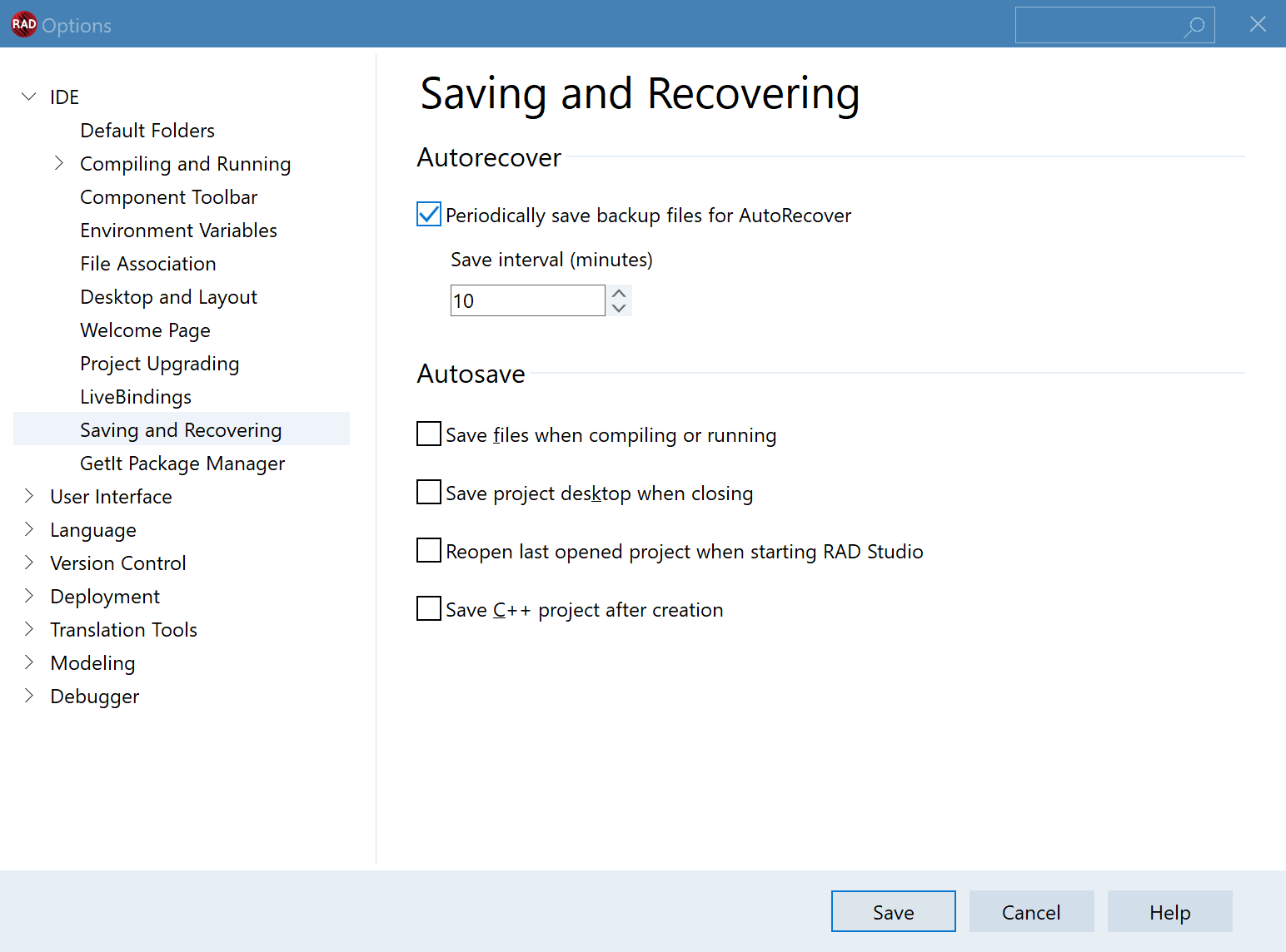
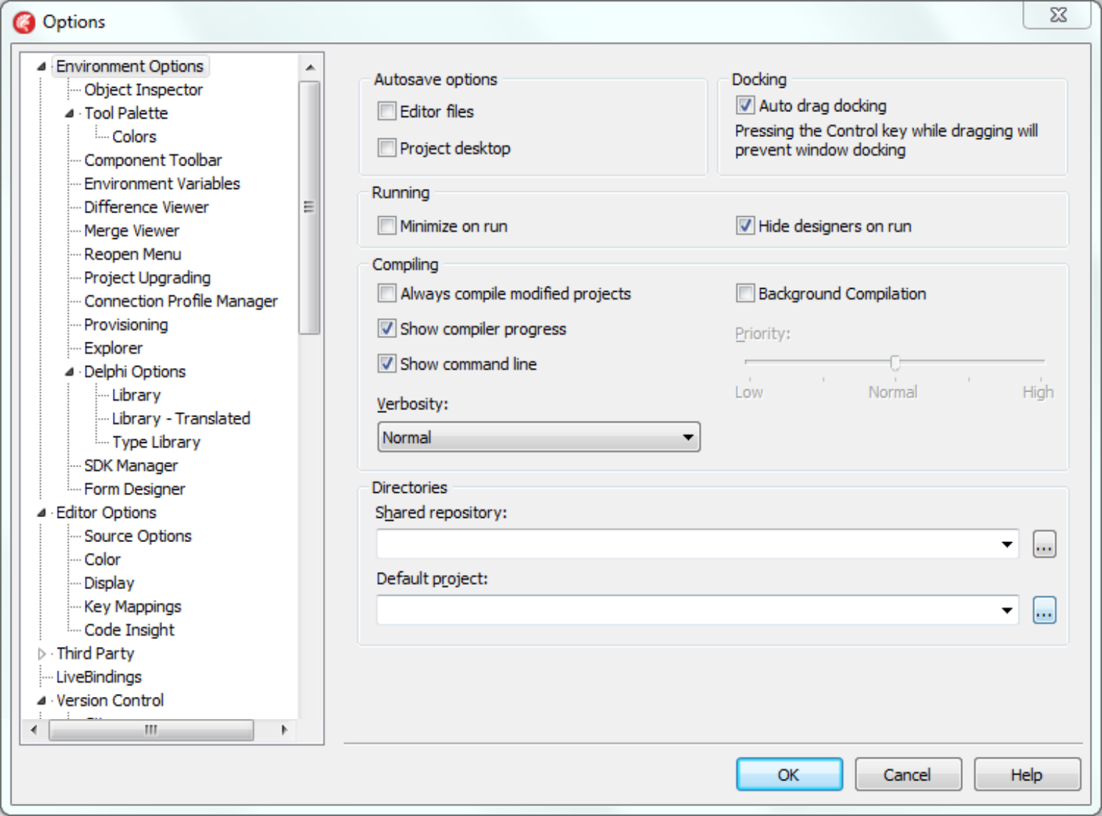
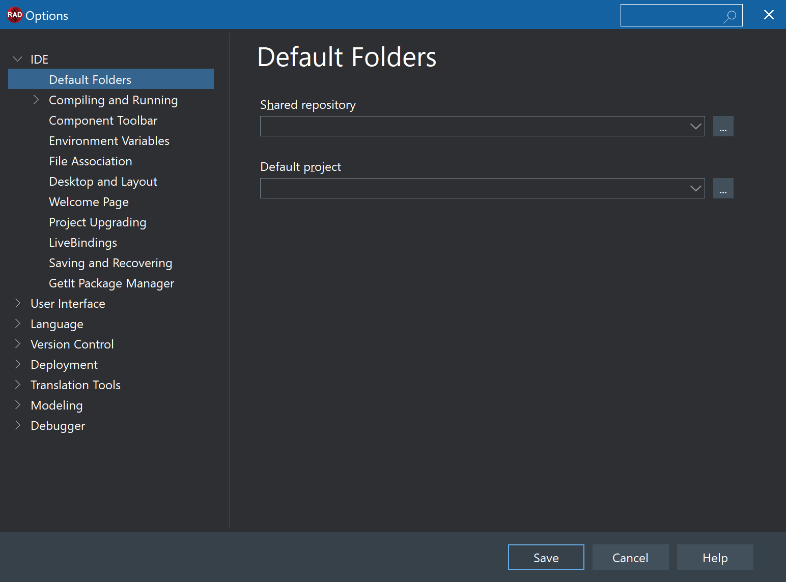
The revised user interface was clean; it used space well; it organised complex items (over a hundred pages in the main options dialog Yes, this was very large software. Why retaining so many settings was correct is the subject of another article… let’s just go ahead here! alone) such that it was easy to find what you were looking for; retained familiarity for longterm users; was understandable for new users; and looked modern. However, the interface is clean and spartan: it is well laid out, but not decorative. It is functional and productive, but sterile, without a hint of human whimsy or playfulness. It is elegant, in a flat Nordic Ikea sort of way, but not beautiful.
Using it was clearly much better than its predecessor. Yet it was not an interface that excited feelings of joy in our users. It was capable and well-done. I expect it left users feeling more calm after hours of use: it required much less unconscious cognitive effort to navigate and use. But I wonder what larger effect it had on their mood as they used it eight hours a day. I expect it had the same effect as a functional, well-built modern office block has, with its ceiling lights and shoulder-high partitions—perfectly normal, right?—compared to the atrium of a château, or the gate opening to a park full of oak trees.
Which one has more beauty, and makes you feel more peaceful or joyful?
The software redesign I oversaw was elegant. But it was not beautiful.
◆ ◆ ◆
This article speaks about a responsibility we as UX designers have to leave our users with positive emotions after spending their day staring at what we put on screen: more, that I personally feel the best minute-to-minute emotion to inspire in interaction is joy, the pleasure that comes from something beautiful that does not need to be. For many UX designers, a clean, flat, sparse, but well-done user interface is enough. Such a user interface, if designed with a good understanding of use cases, UI communication, and flow, will leave your users with a feeling of being productive and of not having to work at figuring out how to achieve their tasks—low cognitive load—and through that pairing, of calmness.
Is that enough?
No.
I would like my user interfaces to leave feelings of three things: human connection, beauty, and joy.
Emotion in Digital Interaction
What causes those emotional responses of a sense of human connection, beauty, and joy in a digital environment?
◆ ◆ ◆
1 — Human connection comes from your user being able to see that someone else took care creating the software, and pride in what they did. It comes from seeing small signs of a human touch. Examples are:
- The TextEdit icon or macOS System Preferences’ Display pane’s previews that, when expanded to full size, contained the first part of a well-known Apple text. At normal size, that was not visible, and did not affect the icon’s purpose. But knowing it was there showed that someone cared about that speech and put thought into something that would mostly gone unseen.
When you see it, some unknown human is reaching out from America to you, and you reach back. These have been removed in recent versions. Why? Did they hurt anything? Did they make macOS less professional? Some people equate professionalism with being boring: the more grey you are, the less interesting, human, whimsical, or joyful, the more professional. This is not true. It’s human connection.

- The Pages icon. Look at the interplay of light in the glass, and the choice of an inkwell and fountain pen (which communicates calligraphy and typography.) It’s clear someone took a lot of time on this image. It shows. That in turn makes me connect to the software. The rightmost Pages icon does not demonstrate the same sense of pride, artistry, and connection: it is brash (bright orange, and especially see how this icon looks viewing this article with your browser set to dark mode), and the choice of a ballpoint is a regression in communicating the concept of fine writing compared to the fountain pen.
The leftmost was aspirational: few of us write the kind of prose worthy of an inkwell and fountain pen, but Pages is leading it as an ideal! The rightmost, with its ballpoint, speaks of normalcy. The sense of someone having created with the goal of inspiring wonder is gone.
◆ ◆ ◆
2 — Beauty in a UI is visual. Where then does on-screen visual beauty come from? From more than elegance (beauty can be found in elegance, yes, but elegance is not beauty): it comes from the interplay of light, shadow and screen-based chiaroscuro, vibrance, from texture, movement and life, and often nature.

Consider the same Pages icon: look at the refractions in the glass inkwell. This image focuses on the interplay of light. While a matter of taste, Consider this recent thread on r/Apple. There’s a reason that and other threads are full of people lamenting the loss of gel and water in Mac UI design: ‘Both iOS and macOS designs have lost a lot of character. Everything is just boring gray now.’ It’s not nostalgia—it’s easy to say that because it was the past, but it’s not nostalgia per se. It’s loss of beauty and artistry.
Water was a wonderful inspiration that touched something we’re all familiar with and delight in. I don’t miss Aqua; I do miss a sense of natural beauty. and while the orange one (above) is elegant especially in the gradients and shape of the pen, the left-side one works harder to create not only the æsthetically pleasing, but a sense of beauty.
If you’re a designer, you may wonder at why I’m illustrating this with decade-old OS X images—and then compare those to my own site, the one you’re reading now, which has a very different æsthetic. This site is monochrome; it is unillustrated in the Pages icon sense, and devoid of light and shadow. Assuming I put my own words into practice, and I try to, why does this site’s design also represent beauty, more than elegance? Because of its typography and details. This site’s design is inspired by pre-1950 printed manuscripts: real world objects. I find them beautiful.
In general, if you seek beauty but find only elegant layout, look to the non-digital world. Humans find beauty in wilderness (forest, moss, desert, mountains), water, skies, architecture, statues, paintings, Maybe books too. and poetry. Look there for your inspiration. All but the last are visual, and poetry can inspire visual design too.
◆ ◆ ◆
3 — Joy comes from unexpected beauty, and the pairing of beauty with human connection.
It helps if you can throw in a sense of wonder.
What Experience Do You Create?
When your software is used, its vibe will have an effect on your user. If used in the office, they will stare at and interact with what you create for a third of their entire day, possibly longer than they do any other activity. It will be longer than they walk in the park, longer than they read, longer than they watch TV, longer than they speak to their partner or play with their children. It is the single activity that will take the most of their entire waking day, and you are the one who creates what that activity will be like.
Beyond a feeling of productivity, what inner emotion do you want to leave them with? What experience do you want to create? Efficiency, particle-board furniture, plastic, artificial light, glass and steel? Or art, nature, beauty, humanity, peace, and joy?
When your users go home after their eight hours a day staring at what you create, how do you want them to feel?
And what have you done to make sure they feel it?